Unidentified Aerial Phenomenon in America
Tev’ye Davis
Introduction
An unidentified flying object (UFO), recently renamed in 2022 as unidentified aerial phenomenon (UAP) are observations of events in the sky that cannot be immediately identified as an aircraft or as a known natural phenomena. Drawing scientific conclusions about what is happening in the sky can only be done by understanding the data surrounding the unidentified aerial phenomena. In U.S. intelligence community, there are five adopted explanatory categories for UAPs. They are; airborne clutter, natural atmospheric phenomena, U.S. Government or U.S. industry developmental programs, foreign adversary systems, and a catchall category “other”. Not only is unidentified aerial phenomena are of interest from a national security perspective but also concerns flight safety, as an increasingly cluttered air space is unsafe. With respects to national security, foreign adversaries’ data collection platforms or adversaries having developed either a breakthrough or disruptive technology is of great concern to the U.S. intelligence community. There have been several studies of UAPs carried out by various US government agencies throughout the years, including a recent report by the Office of Director of National Intelligence, that was declassified in June 2021 which recommended further reasearch and funding. Legislatively, the US House of Representatives recently voted to encourage the sharing of more UFO sightings by adopting a bipartisan amendment to the National Defense Authorization Act. The aim of this study is to create a map depicting the number of sightings of UAP per the 49 contiguous states and identify if there is a cluster of UAP sightings.
Materials and methods
Point locations of unidentified aerial phenomenon sightings were obtained from the National UFO Reporting Center. The National UFO Reporting Center was founded in 1974 and has documented approximately 90,000 reported UFO sightings over its history, albeit mostly in the United States. The shapefile for the states will be obtained from the tigris package, which was filtered to obtain the 49 contiguous states to conduct the spatial analysis. The sdep package will be used to create a spatial weights matrix objects from the contiguous polygons of the 49 states, which will further allow the testing of spatial autocorrelation.
The package leaflet will also be used to visualize or map sightings of UAP from 1969 to 2022. To aid in the processing or wrangling of data and analysis, libraries such as tidyverse will be used. This package will facilitate the transformation and presentation of data, by supporting the importation, “tidying”, manipulating, and visualization of the data. The lubridate library will be used to work with date-times and time-spans, as it allows fast and user friendly parsing of date-time data, extraction and updating.
library(tidyverse)
library(leaflet)
library(htmltools)
library(tigris)
library(maptools)
library(spdep)
library(sf)
library(lubridate)
library(viridis)
knitr::opts_chunk$set(cache=TRUE)  # cache the results for quick compiling
Download and clean all required data
uap = read_csv('https://query.data.world/s/6xru2x6vjkjgz5ck52invxt3j7mc5w')

US_map = states(cb = T)
US_map = as(US_map, 'sf')
knitr::opts_chunk$set(warning = FALSE, message = FALSE)
US_map = states(cb = T)
US_map = as(US_map, 'sf')us_states = c('AL', 'AZ', 'AR', 'CA', 'CO', 'CT', 'DE', 'FL',
'GA', 'ID', 'IL', 'IN', 'IA', 'KS', 'KY', 'LA',
'ME', 'MD', 'MA', 'MI', 'MN', 'MS', 'MO', 'MT', 'NE',
'NV', 'NH', 'NJ', 'NM', 'NY', 'NC', 'ND', 'OH', 'OK',
'OR', 'PA', 'RI', 'SC', 'SD', 'TN', 'TX', 'UT', 'VT',
'VA', 'WA', 'WV', 'WI', 'WY', 'DC')
US_map = US_map %>% filter(STUSPS %in% us_states)Results
Before conducting the analysis, a bar chart was plotted to tabulate the total number of UAP sighting per state, to get a basic understanding of the data.
US_uap = uap %>% filter(state %in% us_states) %>% group_by(state) %>% summarize(n = n())

US_map = left_join(US_map, US_uap, by = c("STUSPS" = 'state'))

US_map %>%
  ggplot() +
  geom_col(aes(x = fct_reorder(STUSPS, n), y = n)) + coord_flip() +
  theme_light() +
  labs(x = 'State', y = 'Number of UAPs') +
  geom_text(aes(x = fct_reorder(STUSPS, n), y = n, label = n), nudge_y = 350, size = 3.5) +
  ggtitle('Number of UAPs per State')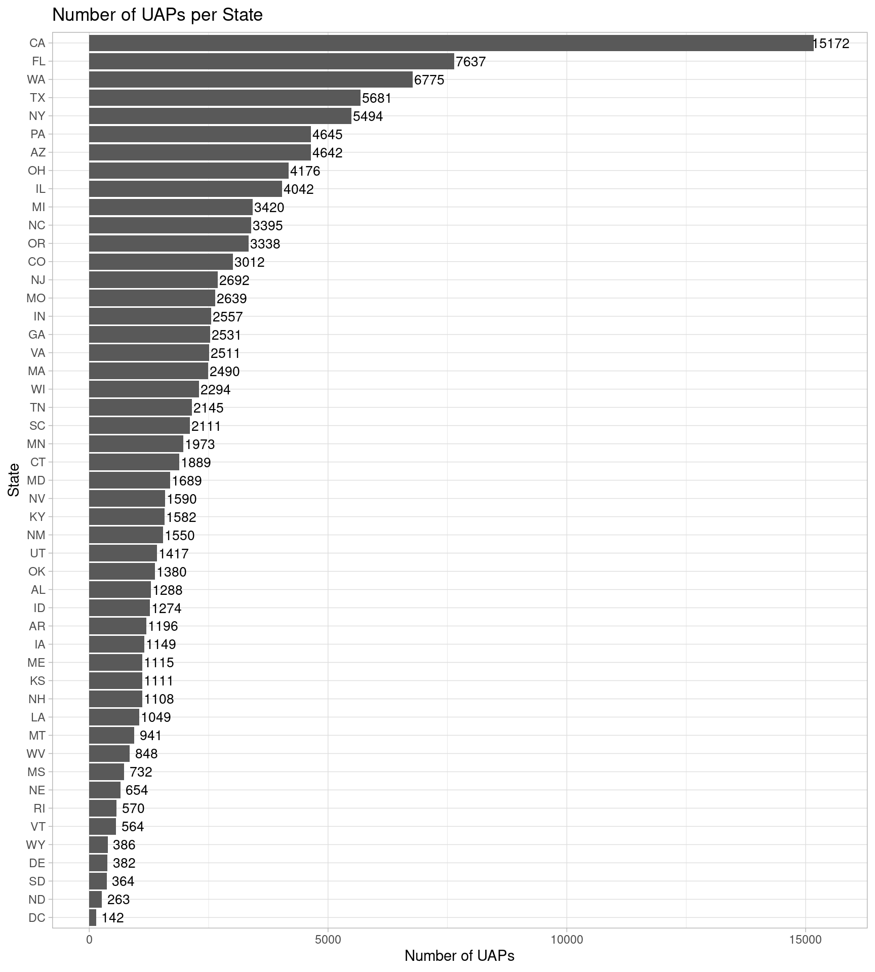
fig. Number of UAPs per State
The bar chart shows that California has the highest number of sightings of UAP and Washington DC has the lowest number of sightings of UAP.
To understand how the aggregate UAP sightings changed over time (i.e. a time series analysis), a line graph was plotted to visualize the number of UAP sightings per year.
uap$year = year(uap$date_time)
uap %>% select(year, state) %>%  na.omit() %>%
  group_by(year, state) %>%
  summarize(n = n()) %>% ungroup() %>%
  group_by(year) %>% summarize(tot_uaps = sum(n)) %>%
  ggplot() +
  geom_line(aes(x = year, y = tot_uaps)) +
  geom_point(aes(x = year, y = tot_uaps)) +
  theme_light() +
  labs(x = 'Year', y = 'UAP sightings') +
  ggtitle('UAP sightings in the USA from 1969 to 2022') +
  scale_x_continuous(breaks = seq(1969, 2022, 5))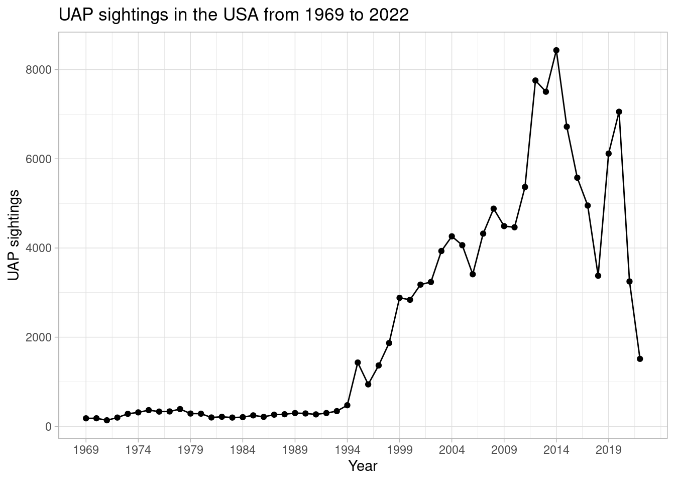
The line graph shows that UAP sightings started increasing dramatically since 1994, peaking in 2014. This was followed by a sharp drop in 2018, a sharp increase up to 2020 and then a drop leading up to 2022.
As first illustrated, there are major differences in the number of UAP sightings per state. To further the time series analysis and better understand how each state UAP sightings fluctuated over time, the number of UAP sightings per year for every state was plotted. Each graph being plotted was limited to 10 states for better visualization and interpretation.
uap %>% select(year, state) %>%  na.omit() %>%
  filter(state %in% us_states[1:10]) %>%
  group_by(year, state) %>%
  summarize(n = n()) %>% ungroup() %>%
  group_by(year, state) %>% summarize(tot_uaps = sum(n)) %>%
  ggplot() +
  geom_line(aes(x = year, y = tot_uaps, color = state)) +
  geom_point(aes(x = year, y = tot_uaps, color = state)) +
  theme_light() +
  labs(x = 'Year', y = 'UAP sightings') +
  ggtitle('UAP sightings in the USA from 1969 to 2022') +
  scale_x_continuous(breaks = seq(1969, 2022, 5)) +
  scale_color_discrete(name = 'State') + ylim(0, 900)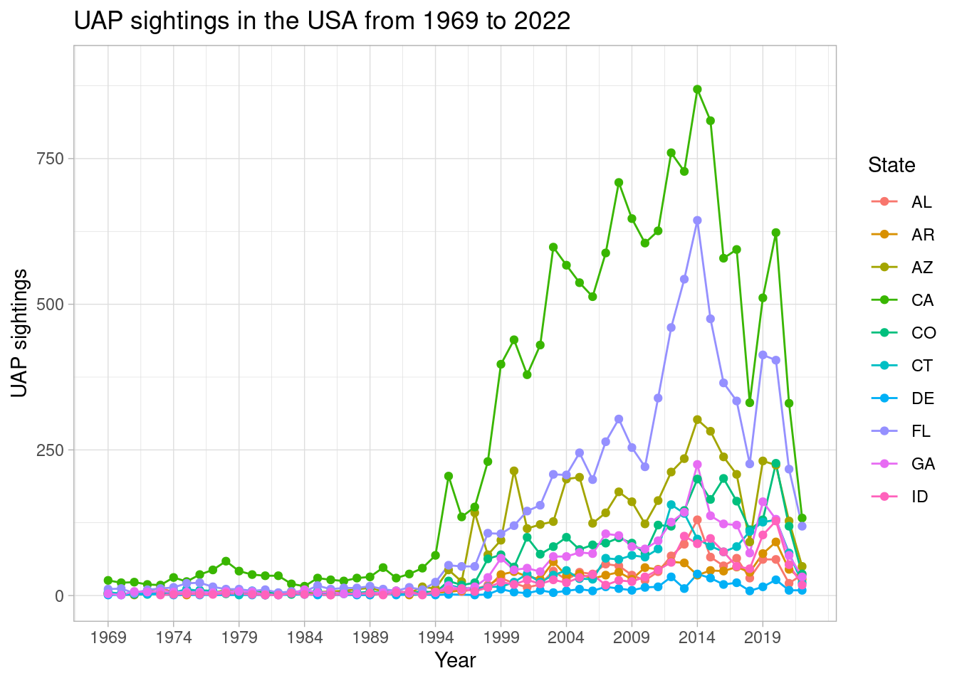
uap %>% select(year, state) %>%  na.omit() %>%
  filter(state %in% us_states[11:20]) %>%
  group_by(year, state) %>%
  summarize(n = n()) %>% ungroup() %>%
  group_by(year, state) %>% summarize(tot_uaps = sum(n)) %>%
  ggplot() +
  geom_line(aes(x = year, y = tot_uaps, color = state)) +
  geom_point(aes(x = year, y = tot_uaps, color = state)) +
  theme_light() +
  labs(x = 'Year', y = 'UAP sightings') +
  ggtitle('UAP sightings in the USA from 1969 to 2022') +
  scale_x_continuous(breaks = seq(1969, 2022, 5)) +
  scale_color_discrete(name = 'State') + ylim(0, 900)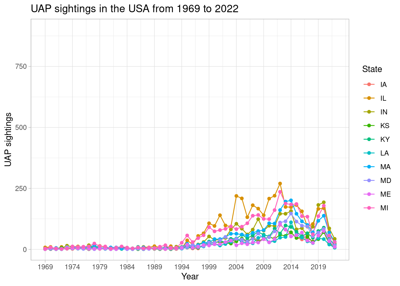
uap %>% select(year, state) %>%  na.omit() %>%
  filter(state %in% us_states[21:30]) %>%
  group_by(year, state) %>%
  summarize(n = n()) %>% ungroup() %>%
  group_by(year, state) %>% summarize(tot_uaps = sum(n)) %>%
  ggplot() +
  geom_line(aes(x = year, y = tot_uaps, color = state)) +
  geom_point(aes(x = year, y = tot_uaps, color = state)) +
  theme_light() +
  labs(x = 'Year', y = 'UAP sightings') +
  ggtitle('UAP sightings in the USA from 1969 to 2022') +
  scale_x_continuous(breaks = seq(1969, 2022, 5)) +
  scale_color_discrete(name = 'State') + ylim(0, 900)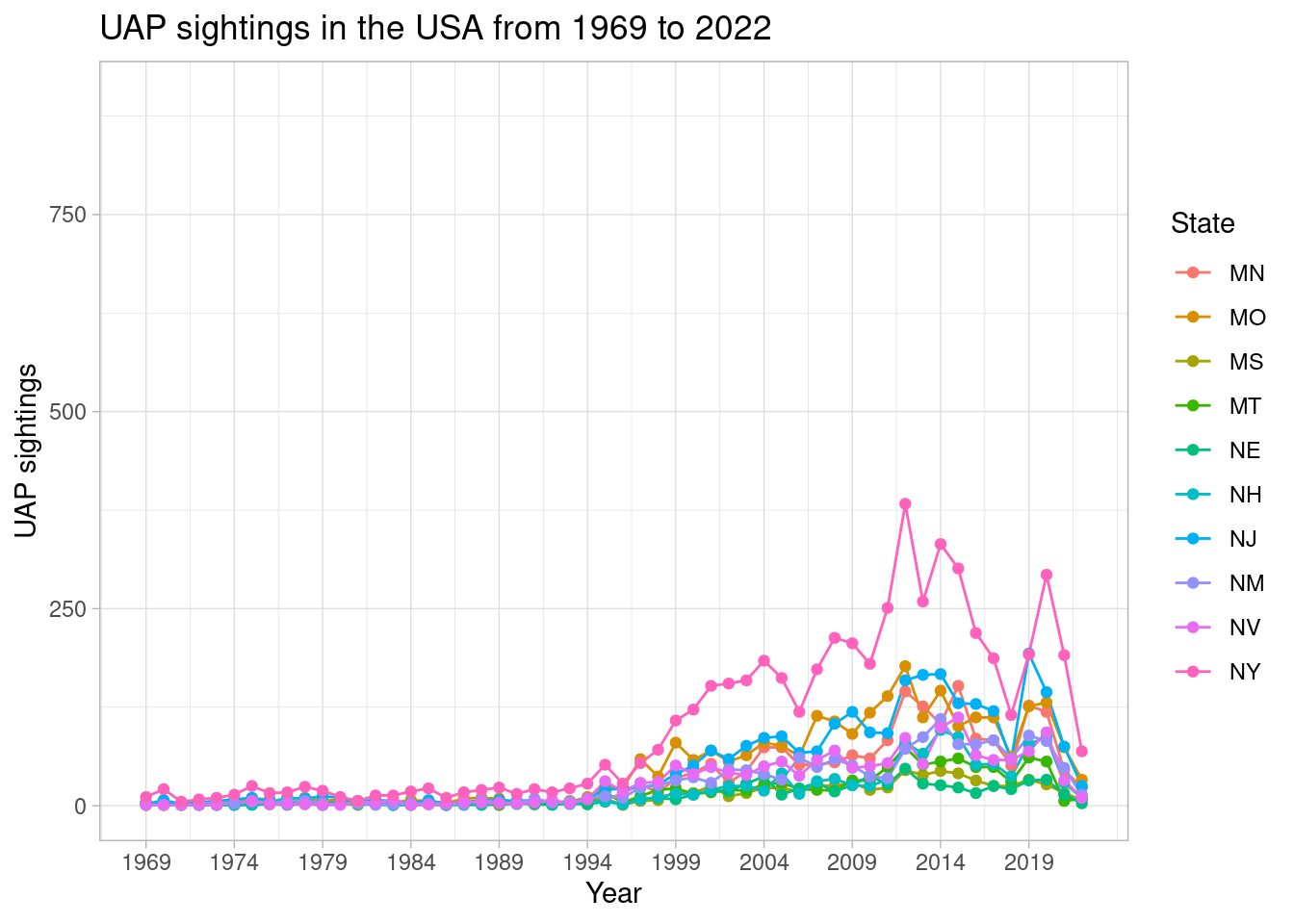
uap %>% select(year, state) %>%  na.omit() %>%
  filter(state %in% us_states[31:40]) %>%
  group_by(year, state) %>%
  summarize(n = n()) %>% ungroup() %>%
  group_by(year, state) %>% summarize(tot_uaps = sum(n)) %>%
  ggplot() +
  geom_line(aes(x = year, y = tot_uaps, color = state)) +
  geom_point(aes(x = year, y = tot_uaps, color = state)) +
  theme_light() +
  labs(x = 'Year', y = 'UAP sightings') +
  ggtitle('UAP sightings in the USA from 1969 to 2022') +
  scale_x_continuous(breaks = seq(1969, 2022, 5)) +
  scale_color_discrete(name = 'State') + ylim(0, 900)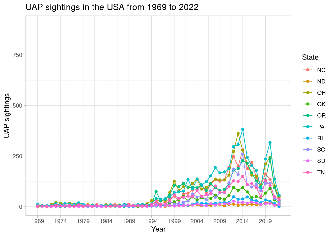
uap %>% select(year, state) %>%  na.omit() %>%
  filter(state %in% us_states[41:49]) %>%
  group_by(year, state) %>%
  summarize(n = n()) %>% ungroup() %>%
  group_by(year, state) %>% summarize(tot_uaps = sum(n)) %>%
  ggplot() +
  geom_line(aes(x = year, y = tot_uaps, color = state)) +
  geom_point(aes(x = year, y = tot_uaps, color = state)) +
  theme_light() +
  labs(x = 'Year', y = 'UAP sightings') +
  ggtitle('UAP sightings in the USA from 1969 to 2022') +
  scale_x_continuous(breaks = seq(1969, 2022, 5)) +
  scale_color_discrete(name = 'State') + ylim(0, 900)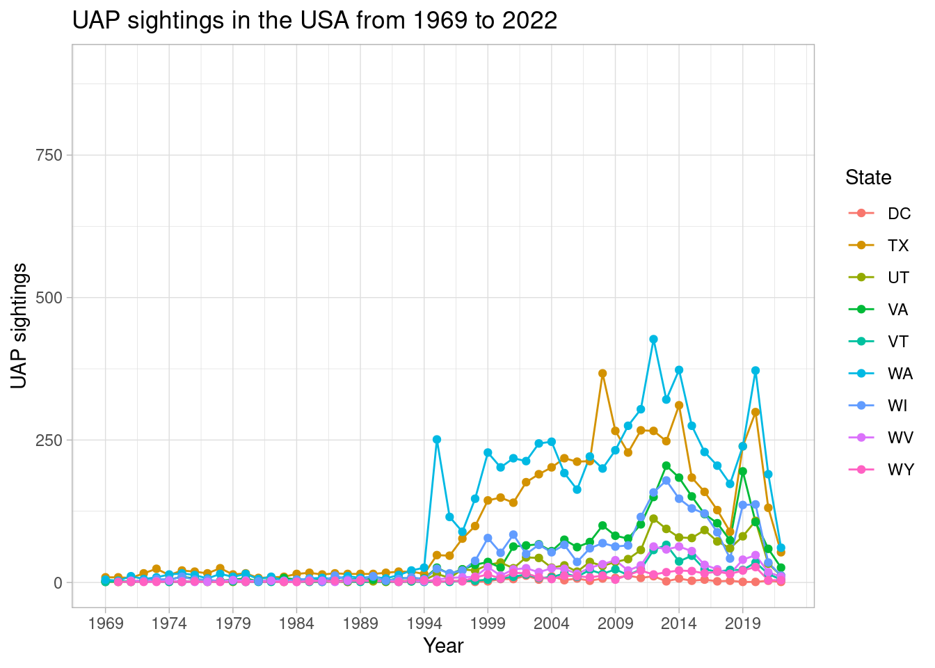
In general, spatial data exhibit increasing range of values (i.e. increased spatial heterogeneity) with increased distance. Another way of saying this, is referring to Waldo R. Tobler’s first law of geography “everything is related to everything else, but near things are more related than distant things.”
Spatial autocorrelation indicates if there is clustering or dispersion in a map. While a positive Moran’s I indicate that the data is clustered, a negative Moran’s I implies data is dispersed. In order to calculate spatial autocorrelation and also model spatial interaction, we impose a structure to constrain the number of neighbors to be considered. Subsequently, a “neighborhood matrix” will be constructed for the 49 contiguous US states, using the spdep package.
US_map_nb = poly2nb(US_map)
US_map_listw = nb2listw(US_map_nb)

US_coords = coordinates(as_Spatial(US_map)) %>% data.frame()

neighborhood = as(spdep::nb2lines(US_map_nb, coords = coordinates(as_Spatial(US_map))), 'sf')
neighborhood = sf::st_set_crs(neighborhood, sf::st_crs(US_map))

ggplot(US_map) +
  geom_sf(size = 1, color = 'gray', fill = 'white') +
  geom_sf(data = neighborhood) +
  geom_point(data = US_coords, aes(x = X1, y = X2), color = 'red') +
  theme_light() +
  ggtitle('Contiguous US neighborhood structure')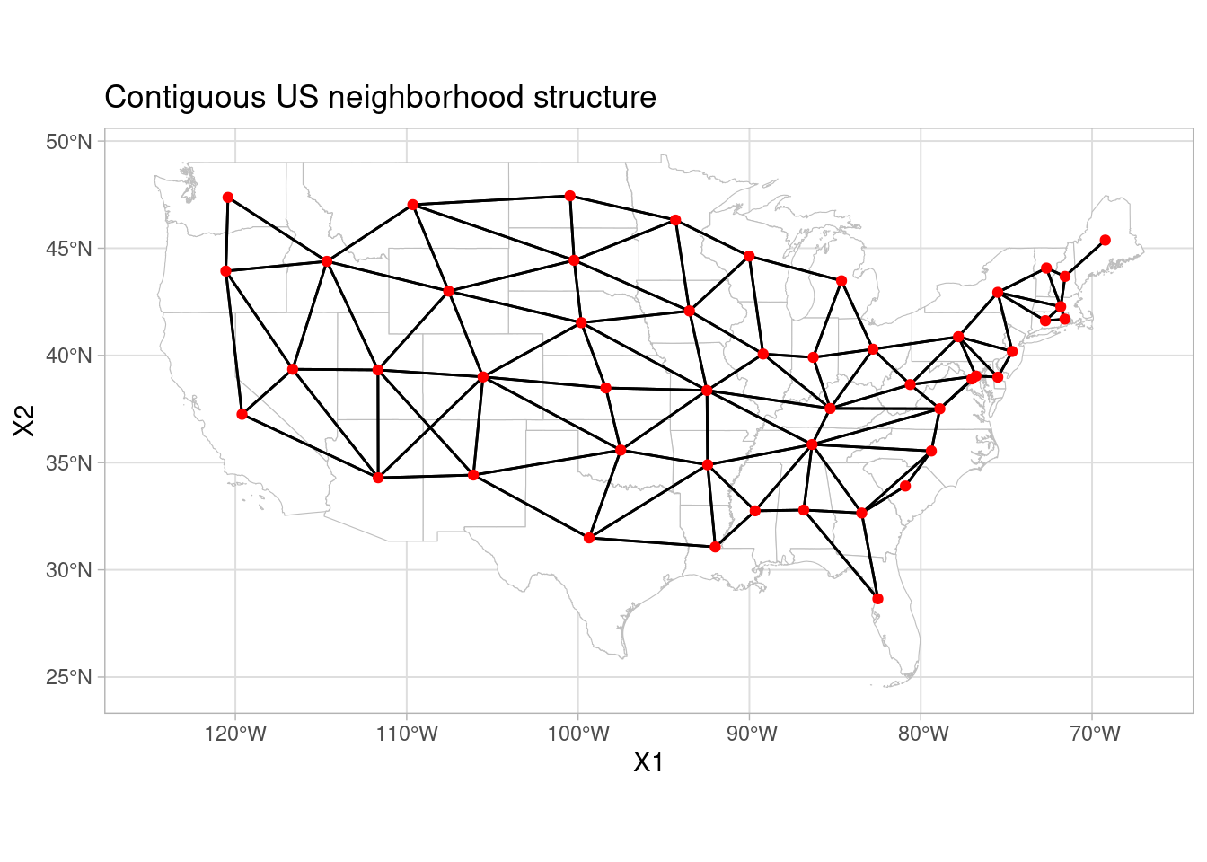
the Global Moran I is defined with the following formula:
I = $\frac{\sum_i\sum_jw_{ij}z_iz_j/S_0}{\sum_{i}z_i^2/n}$ where:
- zi = xi − x̄
- x is the value of the variable on area i
- x̄ is the mean of the variable
- n is the number of areas
- S0 = ∑i∑jwij is the sum of all weights
- wij is the weight of the neighbors. In this case wij = 1 if areas i and j are neighbors and wij = 0 otherwise.
The Global Moran I ranges from -1 to 1. -1 indicates a strong negative spatial autocorrelation and 1 indicates a strong positive spatial autocorrelation. For values near 0 there is no spatial autocorrelation, indicating that the data is spatially random.
Given the global moran I construct, this can be articulated in statistics as a hypothesis test with the following hypothesis:
$H_0:\hbox{ UAP sightings are not spatially autocorrelated} \times H_1: \hbox{ UAP sightings are spatially autocorrelated}$
To remind us of the spatial distribution of the UAP sightings from 1969 to 2022, a choropleth map will be presented and then a test for the spatial autocorrelation.
labels <- sprintf(
  "<strong>%s</strong><br/>%g uaps",
  US_map$NAME, US_map$n
) %>% lapply(htmltools::HTML)

pal = colorBin('YlOrRd', domain = US_map$n, bins = quantile(US_map$n, c(seq(0,0.9, by = 0.1125), 1)))

leaflet(US_map) %>%
  addPolygons(
    fillColor = ~pal(n),
    fillOpacity = 1,
    color = 'white',
    weight = 2,
    label = labels,
    highlight = highlightOptions(
      weight = 4,
      color = 'black',
      fillOpacity = 1,
      bringToFront = TRUE)) %>%
  addProviderTiles(providers$CartoDB.Positron) %>%
  addLegend(pal = pal, values = ~n, opacity = 0.7, title = 'UAP Sightings: 1969 - 2022',
            position = "bottomright")
moran.mc(US_map$n, listw = US_map_listw, nsim = 9999)##
## Monte-Carlo simulation of Moran I
##
## data: US_map$n
## weights: US_map_listw
## number of simulations + 1: 10000
##
## statistic = 0.082942, observed rank = 8926, p-value = 0.1074
## alternative hypothesis: greaterConclusions
A random spatial permutation of the observed attribute values to generate a realization under the null hypothesis of complete spatial randomness was simulated. This was repeated a large number of times 9999 to construct a reference distribution to evaluate the statistical significance of our observed count. UAP sightings from 1969 to 2022 were found to be randomly distributed in America, having a p-value > 0.05. Thus, we accept the null hypothesis. However, one has to be careful about interpreting spatial autocorrelation as measurements are specific to a particular scale, in this case the 49 contiguous states used. If analyzed by county, it may lead to a different spatial pattern or arrangement and scale, thus leading to a different outcome or conclusion. Nevertheless, the statistical techniques employed in this study is useful as it simultaneously handles the locational and attribute information in the dataset. Future spatial analysis could include finding the local Moran’s I using the latitude and longitude and finding hot and cold spots.
References
Goodchild, Michael F. Spatial Autocorrelation. Catmog 47, Geo Books. 1986
Rogerson, Peter. Statistical Methods for Geography fifth edition. 2020